Web design trends during the past year
design03 Dec 2019
3 minute read
This article is a collection of the little features and design aspects I’ve noticed are becoming more and more prominent in web design. I’ve also included beautiful examples and links to tutorials where you can learn how to replicate these patterns.
Scrolling Effects #
There are several scrolling effects becoming more and more popular. One of them which is appealing but a bit over-used is when content fades into view as you scroll. You can see examples here. I think these are interesting and I even have them on my site but understand why people might say they are becoming a bit repetitive.
Another scroll effect is parallax scrolling. Honestly, I don’t really appreciate this one but it’s becoming more and more ubiquitous. It’s a technique where the background images scroll down slower than the main page content to create a sensation of depth on the two-dimensional website. I think it can be done well but sometimes I feel it doesn’t add anything to the UI.
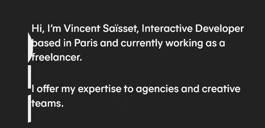
 Screenshot from https://www.vincentsaisset.com/
I truly recommend you check this one out because it uses scrolling to provide a very unique and interesting UX.

WebGL and 3D graphics #
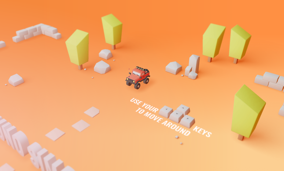
Now I am really excited about these type of effects because they can result in amazing and original websites from creative people. Although WebGL is used for web game development it can also be useful for design. This is becoming more and more popular as technologies like three.js are more and more sophisticated and WebGL becomes less of a hassle for the developer.
Check out this post to make your own WebGL effects.
 Screenshot from Bruno Simon’s crazy and immersive portfolio built with three.js
Skeleton Loaders and preloaders #
It’s often useful to display placeholder content while your data-heavy images or embeds are loading. New techniques like skeleton screens and spinners have become the go-to solution to deal with these problems. They let the user know that something is going on behind the screen and they aren’t staring at a dead website. If you want to learn how to code and design a loader, you should check out this post. This is what should have by the end of the tutorial:
Skeleton screens are a different approach to this problem, but you can learn more about how to build them with CSS with this useful article from CSS tricks.
 How LinkedIn uses skeleton screens while its content is loading.
Colorful Vector Illustrations #
These svg illustrations are stunning. They truly embellish the website and add a lot to a website’s clean, sleek design. You can even get them for free now at awesome websites like Illlustrations.co and even customizable ones at Undraw.


Minimalism #
Minimalist websites are hard to pull off. These are simple yet well put together websites that have a sleek user interface and a good flow. From a small set of elements, the best minimalist websites should have an entrancing yet practical webdesign. Careful! Minimalists websites should not be confused with text-only sites. If you enjoy text-only here are a few that originated on a hilarious reddit thread (I recommend that you view them in order):
- http://motherfuckingwebsite.com/
- http://bettermotherfuckingwebsite.com/
- https://bestmotherfucking.website/
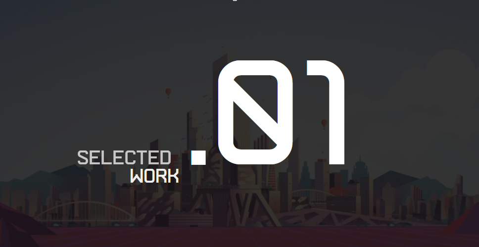
To finish this article, here are some appealing websites and portfolios I’ve found the last year:


If you have any other interesting ones I’d love it if you could link them down below and you can also subscribe to my customizable newsletter if you want to hear more news about design.
I hope you enjoyed it!